An ai home color palette can help you move past endless paint swatches and second-guessing. Color decisions feel emotional because they shape how a room receives you. Many people know what they dislike but struggle to name what they want. AI can translate preferences into clearer direction. It can compare moods, materials, lighting, and existing furniture. You still make the final choice. The tool simply organizes the options. That structure saves time. It also makes design feel less intimidating.
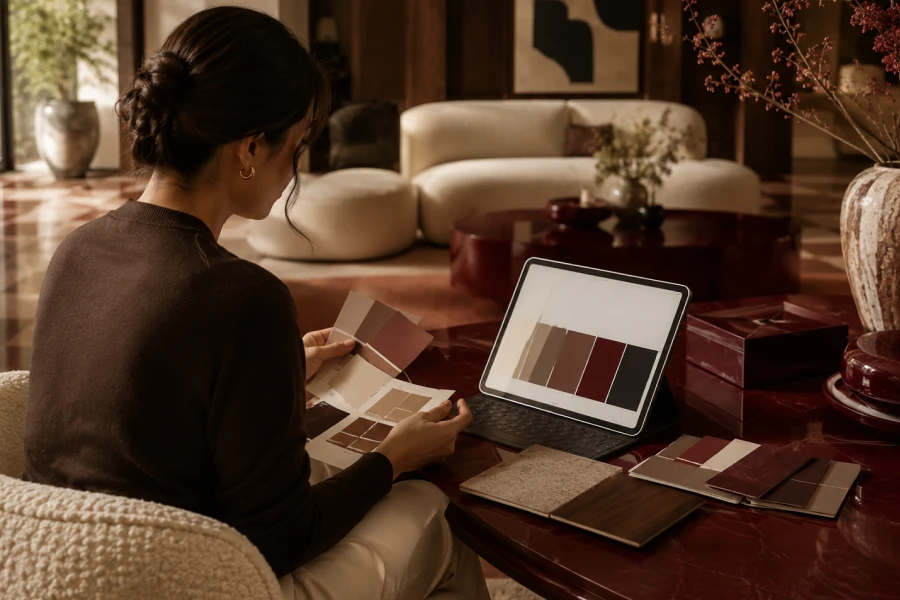
Traditional color planning often starts with trends. That can make homes feel disconnected from real life. AI planning starts better when you feed it context. Share your room size, light direction, flooring, and favorite textures. Mention the mood you want. Add what you already own. The result becomes more personal. It reflects constraints instead of ignoring them. A digital home design system helps turn vague taste into usable direction.
Color never lives alone. It reacts to floors, cabinets, windows, rugs, and trim. A beautiful shade can feel wrong beside the wrong undertone. Morning light changes color differently than evening light. Artificial bulbs shift it again. Take photos at several times of day. Note which corners feel dark. Notice what furniture dominates the room. Good palette planning starts with observation. For a related approach, explore AI-supported mood planning for interiors.
Better prompts create better options. Ask for three palette directions, not one answer. Request warm, cool, and balanced versions. Include the surfaces you cannot change. Name the mood precisely. Calm, airy, intimate, playful, and refined all lead somewhere different. Ask for accent colors separately. Request a testing plan before buying paint. Use AI as a design assistant, not a final authority. This keeps AI color planning grounded in your actual room.
Undertones decide whether colors cooperate. Beige can lean pink, yellow, gray, or green. White can feel warm, blue, creamy, or stark. Wood can push a room warmer than expected. Stone can introduce hidden coolness. AI can help name these relationships. Still, your eyes need samples. Paint chips look different on walls. Large swatches reveal more truth. Compare colors beside floors and fabrics before committing.
Testing protects you from expensive regret. Print the palette if possible. Place samples near furniture. View them in daylight and lamplight. Compare them against trim. Look at them on cloudy days. Ask AI to predict risks based on your notes. Then trust real samples over digital previews. Screens distort color. A personalized room palette becomes strongest when technology and observation work together.
The final palette should feel lived in, not generated. Keep one emotional anchor. It might be a rug, artwork, chair, or memory. Let that piece guide warmth and contrast. Use AI to refine, not erase, personal taste. Avoid copying trends that do not match your home. Choose colors that support your daily rhythm. The best rooms feel edited and intimate. They look designed, but they still feel like yours.
Leave a comment