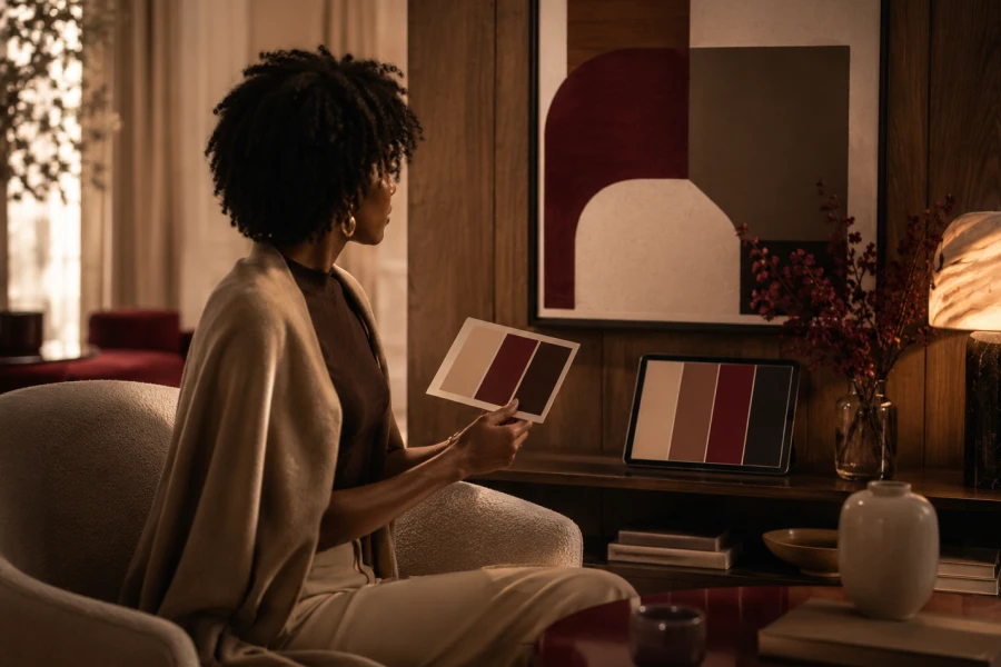
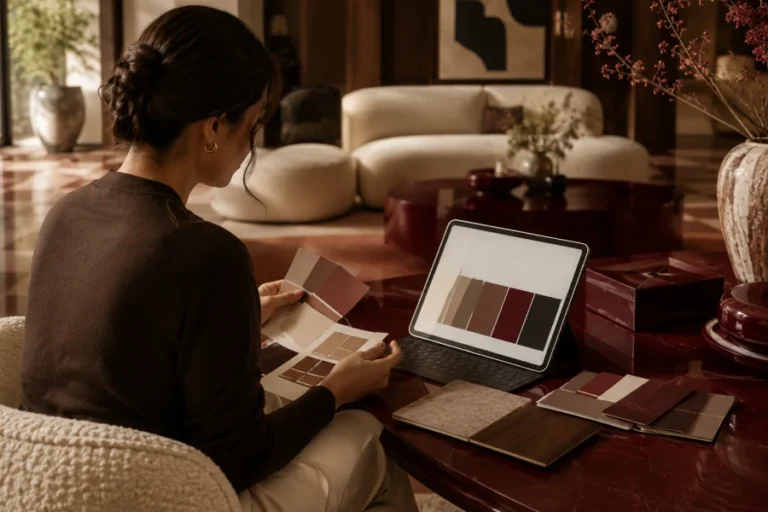
An ai interior color palette becomes useful when it connects color to feeling. A room is not only a collection of finishes. It is a place where energy rises, softens, or settles. Many homeowners choose colors based on isolated inspiration images. Then the finished space feels disconnected. AI can compare mood words with visual structure. It can suggest contrast levels, accent placement, and tonal balance. You still need judgment. But the process becomes clearer, faster, and more intentional.
Color affects how a room behaves emotionally. Warm tones can make a space feel close. Cool tones can make it feel open. Deep colors can feel protective. Pale colors can feel quiet. AI helps by translating mood language into palette logic. It can explain why certain combinations work. It can also offer alternatives when your first idea feels off. A smart interior styling tool gives language to instincts you already have.
Inspiration images can mislead you. They often show perfect lighting, staged furniture, and edited colors. Your room has different windows. Your flooring may have different undertones. Your furniture may feel heavier. A screenshot cannot solve those realities. Use images as direction, not instruction. Ask AI what makes the image work. Then ask how that idea changes in your space. For practical next steps, visit room-to-room color flow planning.
Open layouts need controlled variation. Every zone should feel connected without becoming flat. Use one base neutral across shared sightlines. Add depth through textiles, wood, or metal. Let accent colors repeat in small doses. AI can map which shades belong where. It can also warn when contrast feels too scattered. Test the palette from several viewpoints. A cohesive home color plan helps open spaces feel intentional.
Trend colors create excitement, but they can age quickly. Personal taste lasts longer when it reflects how you live. If you love calm mornings, avoid colors that feel visually loud. If you host often, consider warmth and flattering light. If your room feels dim, test deeper shades carefully. AI can generate trend-aware choices without letting trends dominate. Ask for timeless versions of current colors. This keeps the room fresh without making it feel temporary.
The biggest mistake is accepting the first result. AI gives direction, not certainty. Another mistake is ignoring materials. Paint interacts with upholstery, flooring, metal, and stone. A third mistake is choosing too many accents. Restraint makes a room feel more expensive. Ask for fewer colors when the palette feels busy. Request a hierarchy for base, secondary, and accent shades. A color palette generator for home works best with careful editing.
Digital planning should always meet real surfaces. Order samples before painting. View them vertically, not flat on a table. Move them around the room. Compare them near fabrics and wood. Watch the color morning, afternoon, and evening. Take photos, but trust your eyes most. Ask AI to interpret what changed. The final choice should feel calm in the actual room, not just attractive on a screen.

Leave a comment